Wednesday 23 May 2012

Confidence building

One of my aims over the last couple of weeks has been to get more pupils presenting their work to the class. I think it is important the young people develop the confidence to stand in front of an audience and present their ideas to peers whilst improving their speaking and listening skills and developing a good understanding of what makes an effective presentation. Confidence develops through many experiences, because of my background I think I always favour the Duke of Edinburgh character building style activities, but the classroom environment can certainly play its part. At the end of the day it is often these skills and confidence in your own ability that get you places in life and can be overlooked in the rush for good grades. I’ve certainly found that the confidence I developed at school has played an enormous part in getting me the jobs and opportunities that I’ve been lucky to experience. This article sums it up quite well.

One step at a time..... presenting at TED. Image-Ted.com


A key barrier with the presentation has been trying to encourage all members of the class to consider speaking. It usually turns out to be the same keen (but very articulate) pupils volunteering. So how to tackle this? One recommendation from a colleague is to get everyone to present in the class so there is no option involved. If you set the ground rules for how the presentations will be given and received e.g people need to listen quietly and be respectful, but also think about the feedback  they will give the speaker after each presentation. 

I’ve tried the bribery option with chocolate which encouraged a reasonable turnout. I would also like to start with group presentations and then work down to solo presentations to build up confidence gradually. All of this involves trying things out over time, hopefully something I can focus on next year.

A few ideas in preparing and presenting that I want to focus on:

  •          Develop peer review questioning: Provide a clear outline and success criteria of what questions pupils need to consider.
  •          Giving good examples of effective presentations and poor presentations and getting pupils to think of what works and what doesn’t work. This could help focus the effort on putting together the presentation and learning the topic as opposed to becoming bogged down with the tech. For example, quite a few of the year 9’s really got into using Prezi and although it was nice to see the interest and fascination I wondered if they spent too long on the tech to the detriment of the research they were doing on droughts. Perhaps use clips from TED talks or Youtube and get pupils to think about what the strengths and weaknesses of the presentation were.

      Keen to hear peoples suggestions/thoughts/ideas


*UPDATE: 24/5/2012*


The BBC published an article this morning about how the Labour Party wants to increase public speaking opportunities in state schools. I'd like to think they got the ideas after reading the blog post last night, but i'm not convinced ;-)


The article can be found here


Saturday 19 May 2012

Forgive me father for I have sinned.........

My fondness for Android OS and devices hasn't been helped by the below par appearance of the Samsung Galaxy Tab 2 earlier in the month. I've been pretty keen to get a tablet for a number of reasons, one is the Iceland trip in June and July where I want something light and portable with me so I can blog/keep a dairy, read the web, record data and lesson ideas, keep in touch with the Mrs etc. My placement school has also recently acquired a number of Ipads with Apple TV  which opens up more opportunities for viewing geographic data and conducting geographical enquiries with pupils.


The start of something?
These reasons, along with the obligatory present to myself to celebrate the end of the PGCE, resulted in me buying an Ipad 2 earlier this week. I managed to get a refurbished one from Apple at a reasonable price.


Keen to hear from existing Apple users as to the best geography apps to get for the Ipad.


Friday 18 May 2012

Trembling Towers

I've been trying to push independent investigation and learning with a number of my classes in the last couple of weeks, it's been really interesting seeing how different groups and ages respond to the various creative research challenges i've given them.

For my Year 8 group I set them the challenge of building an earthquake resistant house.We've spent the last couple of lessons looking at what design features go into 'proofing' a building in a High Income Country and how this differs to a Low Income Country. 


Yesterday's lesson brief was for each group of four/five students to design an earthquake proof building. The building needed to be at least 2 stories high (this could be interpreted liberally), they could only use the straws provided by me, paper for walls, and I dished out sellotape so they wouldn't just be sellotape buildings (and to save the worlds sellotape supplies). The buildings also had to survive my Earthquake test: violent shaking on a tray monitored by a seismograph app on my phone.


The designs were all unique and impressive. I let the pupils choose their own teams for a change, which turned out to work well with this group as they remained focused, although two pupils who are renowned trouble makers couldn't help but muck about so didn't last long, a shame as I thought the task might engage them more than usual. Each team was awarded points out of ten every 10 minutes or so based on my judegment of the effort and creativity going into their designs, this seemed to tap into their competitive spirits and push them onto to improve their designs. There were some very well thought out reinforced pillars, clever tower designs and flexible walls.


The girls' design - safest of the lot!
Today was test day. Their first task was to decide how they would evaluate the success of each building to resist earthquakes. They set a time limit (30s), how well each building could hold onto equipment in the house (sellotape real), whether any debris fell off, and if it remained up right. We wrote up the scores on the board. After each test pupils had to peer review the designs idenitying the strengths weaknesses and areas for improvement, although this worked as a good springboard to get ideas and comments going, it proved difficult to get some of the boys to focus on reviewing when they seemed set on getting the next building up for the test. 


Next time I may review when we do the peer review element, increase the range of resources available but perhaps give some pupils the resources of a HIC and some a LIC to demonstrate what can be achieved with more money and technology. Good fun though!

Tuesday 15 May 2012

New APProach to learning...


..... boom,boom. I'll avoid the headline puns from now on.

Below is a list of apps that I've found pretty useful for learning both inside and outside the classroom and also developing my own knowledge and teaching. I'm an Android not an Apple user, controversial I know, but I try not to get too bothered about operating systems. An Android phone is just a lot kinder on my bank balance at the end of each month!

It's not a mega list, just those apps I use fairly regularly and like. Click on the App name to view it in Android Market.

 IGeology app by the British Geological Society -  Upload a geology map of anywhere in the UK and find out what's under your feet. Very useful when out on field trips. Does need a good data connection to work properly - I found this out to my frustration whilst looking at coastal erosion at Holderness. No 3G signal :-(

Grid referenceGives you a UK grid reference from 4 to 10 decimel places. Always been pretty accurate for me whenever i've used it.

Maverick - View a vast range of open source, Google, and Ordnance Survey maps on your mobile down to 1:25k. Very useful for checking out an area when out and about. If you view an area whilst on Wifi it should cache the map on your phone memory so you can view the same area when out of signal.

My tracks -  Record your running/walking route and monitor timing, avg speed etc. You can then upload to Google Drive to use in excel/word etc. Has the same features as a £140 GPS running watch but this app is free. Could be handy for controlled assessment or field work for tracking routes.

TED talks - If you've not come across TED yet, get watching now! Lots of inspiring speakers. View all the TED talk archive from your phone. Best used with wifi or good 3G. Handy when trying to find a relevant video for a lesson

BBC News - Does what it says on the tin. Useful for up to date news on the go. I use it regularly to check what breaking news relates to the topics i'm currently teaching.

Met Office - Rain, satellite, weather warnings, forecast and synoptic charts on the go. Weather geekness! Not used this in the classroom yet, but it could be nice to start a lesson off by reviewing the current synoptic charts and encouraging pupils to explain what is happening weather wise.

Twitter - Again, not used this live in the classroom, but from a personal development point of view I find it invaluable for finding out new things and learning from colleagues across the country.


Sorry, another energy related post......


The Department of Energy and Climate Change have released new data on domestic energy use for the whole of the UK for 2010. You can find the original data here. The legends that are the Guardian datablog team have presented some of these data in Google fusion (click to access) in a similar way to the fuel poverty data I talked about in a previous blog post.


The data relates to really specific areas called Middle Layer Super Output Areas. This isn't quite as detailed as the data I used for the fuel poverty maps, but with each Middle layer representing about 5,000 odd people, it's still really useful. The Guardian have only mapped electricity and gas so rural areas wont be fully represented as a lot will be on fuel oil and LPG.


Multi coloured Scotland (from an energy perspective)
Anyway, enough of the energy geekness. I think the fusion maps would be a really good way of representing how much electricity and gas the average home uses. The ability to present the data at various scales could allow comparisons between different areas and also encourage pupils to think of the importance of scale and place. The class could be encouraged to think about why some areas might use more energy than others; Is it due to affluence, weather, location? It helps that you can click on each sub area and compare the consumption in that output area with the UK average which is useful. It's quite interesting as there doesn't seem to be an overwhelming correlation with wealth. But, the richer you are the more insulation and new build  homes you can afford resulting in less energy, whilst the poorer you are the less energy you can afford full stop.


It would be interesting to get pupils to bring in their parents' energy bills and try to work out whether they sit above or below the average energy use for where they live. What solutions can they think of to ensure everyone has access to green, affordable energy? Different groups of pupils could be given the data for different parts of the UK and a fixed budget and energy saving kit list to spend their money on. What would they choose? Why?


Sunday 13 May 2012

Life as a rear gunner in a Lancaster.

Whenever i feel stressed/down/under pressure I find it comforting to compare my situation with that of my Grandfather nearly 70 years ago. He was a Flying Officer, Rear Gunner, in Lancaster Bombers during the Second World War and before he died he wrote this superb account of a day in the life (click to open).


Suddenly, dealing with a class of 30 kids or ploughing through paperwork seems a little tame compared with the threat of a Messerschmitt 109 on your tail.


Iceland mission, I need your help....

In June I'll be heading out to Iceland for around three and a half weeks to help Dr John Stevenson dig holes and gather tephra samples (amongst other things). I'm pretty excited as I've never been to Iceland before but read/watched/heard a lot about it and nearly went there on honeymoon until a volcano put a spanner in the works.... 


It would be quite cool to be around if this happens again

We'll be living in the finest campervan Iceland can offer which will mean we'll have access to most of the Island from a decent base. I'll be keeping a blog diary as well to outline what we're doing and where we end up.


With this in mind I've started to think of lesson ideas and activities that could use resources and information I gather in Iceland. Without knowing exactly where we will be this is a little difficult, so i'm turning to the experience and knowledge of the Geographers of the UK and the Twittosphere to ask for recommendations for places to visit and resources to think about. I've already come across and used a number of great ideas and resources such as David Roger's great Iceland study aid which are helping to stimulate some ideas.


I would quite like to create a virtual field trip perhaps around a volcano with photos, videos and a few samples. I'm also keen to get as much information as possible on the local impacts the volcanic eruptions have in terms of destruction of infrastructure, effects on day to day life, social and environmental impacts etc. I think this could fit into a nice lesson or two that assess the impact of eruptions from a local and global perspective.


All ideas and and suggestions for locations to visit are welcome!


Friday 11 May 2012

Cash poor; fuel poor


Fuel poverty is when a household has to spend 10% or more of its income on heating the home to a reasonable temperature (the Government considers this to be 21C in the main living area and 18c in other rooms). Fuel poverty comes about from rising energy prices, low income and poor home energy efficiency. It doesn't matter if you heat your home by mains gas, LPG, fuel oil or electricity.


The last few years have seen an increase in the number of fuel poor households, if you’re the bill payer in the house you don’t need me to tell you that energy prices have shot up. This is the biggest contributor to pushing the figures up to a point where 5.5 million homes, or 21% of all household in the UK, are in fuel poverty, a rise of around 1 million when compared to 2008, based on DECC's latest data. 4.5 million of those homes are classed as vulnerable (elderly, children or disabled).


So it's a significant social issue that's getting worse.


I've talked about fuel poverty in a couple of lessons, mostly linked to the energy topics in GCSE. One of the issues I faced was trying to convey the scale and depth of the problem across the UK as it's not talked about that much in the media. IT systems allowing, I've used a map I produced last year when I was doing a bit of work on fuel poverty as part of my previous job. I got the idea from a similar map produced by Alasdair Rae for the Guardian looking at the Indices of Multiple Deprivation (IMD) - basically how deprived a specific area is. The maps use data from the Office for National Statistics that is broken down into tiny areas, smaller than each Local Authority called Lower Super Output Area (LSOA). They're designed to represent areas of equal population size, around 300 people, so the data is really specific.


I presented the fuel poverty data for England in a Google Fusion map. Fusion is a pretty cool, free data/GIS package that's been around for a couple of years and is pretty easy to use as these things go. I'm really keen to get pupils trying it out but haven't had the chance yet.


This link should take you to the fusion table of fuel poverty in England for 2008. To access the map you need to click on the Visualise tab > map, and then zoom in to England. It can take quite a while for each area to load up because of the amount of data presented, and some areas will need to be zoomed right in to show anything. If you click on one of the LSOA areas it brings up the number of homes in fuel poverty and the % affected. I think the choropleth map is pretty effective at showing the scale of the problems across the country.


A few questions that could be linked to the map to encourage pupils to explore the areas further. I'm thinking GCSE/AS level with these.

  • Describe the distribution of fuel poor household across England
  • Compare an area in Cumbria with an area in Middlesbrough. One is a rural and the other is urban. Why do you think homes in both of these places are fuel poor? Are the reasons the same?
  • Choose one sector of a city that suffers from fuel poverty. Research the chosen city to identify the reasons why fuel poverty is such a problem. Think about the local social and economic impacts.
These are just off the top of my head. Interested to hear about how other people have used Google Fusion.


Wednesday 9 May 2012

Avalanche of ideas

There are a few areas of Geography which I really enjoy but haven't had the chance to teach this year. One is good old fashioned weather. It might not be fashionable, but I think there's a real need to understand the basic principles behind air masses, fronts etc.
I would also love to teach a unit on mountain environments and glacial geomorphology, there's a nice section in the Edexcel GCSE A Unit 2 on avalanches which is right up my street. 

Thanks to MontyMIC I managed to get out for a weeks off piste skiing and touring in Switzerland in the first week of April. Although the weather was pretty warm at times, it did mean there was plenty of avalanche action to get pics of.  I thought the photo below could be used to demonstrate the power of avalanches. It's a little different to the classic shot of a ski village submerged.

Avalanche debris. Grimentz, Switzerland

But not quite as dramatic as this video from France of a ski lift being destroyed.

Then again we get our fair share of avalanches in Scotland, the Lakes, and Wales. A  good clip here of the Buchaille from Mike Pescod's blog showing how avalanches can sometimes be more than airborne powder or slab. It demonstrates the impact a sudden rise in temperature can have on the stability and consistency of the snow pack. Pupils could be asked to think of creative solutions to reducing avalanche risk and increasing survival rates. There are some pretty effective ideas already out there that they could get inspiration such as transceivers, the Avalung and avalanche airbags. The video below demonstrates the theory behind the air bag. I've not had to test mine yet, thankfully.


Avalanche forecasting in the UK is carried out thanks to the work of the SAIS. I like the idea of getting pupils to develop an App that is effective at predicting avalanches - what information would they need to include? Where would they information from? Who else apart from skiers, climbers and hikers would the app be useful for? I like to bring in my personal experiences and knowledge into lessons when it's relevant so might use this article as a prompt before getting pupils to write a news account of an avalanche accident or lucky escape.


If you're really keen you could get pupils to work in small groups to demonstrate probing and searching for avalanches with a few props, the creative use of a white sheet, some chairs as the debris and a willing volunteer to hide underneath?! 

I was going to say it's not the most seasonal post, but then I saw the forecast for tomorrow for NE Scotland!


Tuesday 8 May 2012

Getting active with volcanoes


I'm lucky (in more ways than I can think of) to be married to a very creative and hard working primary school teacher. Lucy is also a Geography graduate so understands why I get excited about mountains, moraine and mounds of data.

She also much better than I am at persevering with creative ideas. The photo below of the cut out globe with the different layers of the earth from crust to core took hours of drawing, painting and cutting. The globes behind are the attempts by her Year 5 class. 

Mrs Monteith's cut out globes.

I'm thinking of using the globe idea next year as an alternative to the cut-out-and-stick-together paper earth cross section I got the year 8's to do this year. It's a little bit different and builds on the 3D cross sections that a few of the BBC clips use.

A few other ideas that went down pretty well in explaining tectonics and earthquakes:

The humble Jammy dodger


I had great expectations of this being a neat and tasty way of simulating plate boundaries. A constructive plate boundary could be simulated by breaking the biscuit in the middle and as it is pulled apart the red jam simulates the magma filling the void between the plates. The destructive was the two parts of the biscuits coming together and the heavier side being pushed underneath the lighter one. The conservative boundary relied on the two sides of the biscuits catching on each other until enough force is applied that they shift past violently. Perhaps due to my choice of imitation, poorer quality Jammy dodger biscuits the reality was a little different: the magma didn't really ooze out in many of the biscuits and the conservative boundary resulted in desks full of crumbs and biscuit dust. should have know own brand wouldn't be up to the mark. Still a useful aid which reinforced the hand movements for plate boundaries we had learnt in an earlier lesson.


Seismograms as sound


earthquake

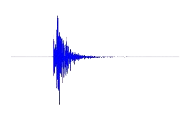
My friend, Dr John Stevenson, is Post Doc researching volcanoes at Edinburgh Uni. He's a man who knows his magma and loves his lava, so his excellent blog is usually my first port of call for anything volcano/tectonic related. One particular blog post is about how he's converted the traces from seismograms into sound files. The three sound examples of an earthquake and volcano on his blog are a pretty neat way of highlighting the different types of movement inside the earth. I played the clips to the class one after another and got them to write down and describe what they thought was happening and which sound they found scarier. I didn't do so well in explaining that the sounds weren't actually real and should have made the link with the seismogram clearer. Another area of improvement for next time.

What to pack for an earthquake?

I've seen this used a few times now. The ideas is to get pupils to think about what 5 or so items they would pack in an earthquake emergency survival bag. I've done it before where we watch a clip of the Japanese tsunami raging through the towns before they pack the bag. This normally focuses minds on what essential items need to be included (although one lad still insisted on taking an RPG and set of mines - to much CoD). Higher ability pupils explain what they couldn't take and what they prioritised, whilst the film seems to be good at helping the lower ability pupils frame the problem and think of things for that specific problem. The BBC example of an earthquake grab bag gives them an idea of what is actually included.

Contents of a grab bag

Always keen to hear about other great volcano/tectonic activities and people's experience of using them.

Monday 7 May 2012

Creative research the Year 9 way!


This term and last term the scheme of learning for the Year 9 classes I teach has been called 'Global Issues'. In a nutshell this means teaching current, relevant topics that loosely fit into the category of a global issue - human or physical. We've covered the rise of China looking at the growth of their economy through companies such as Apple; the impact of Fairtrade on the UK; and this term, the reasons behind the UK's drought and the Icelandic ash cloud of last year. 


I've really enjoyed the flexibility and scope for creativity teaching this topic, this been reflected in the lessons which I think have been my most creative and interesting. Running with a current affairs issue related to geography with a flexible SoL has been really liberating and fun (I do owe a lot to Alan Parkinson and David Rogers for the ideas and resources on their blogs though!).


This has also been the first topic in which I've had the opportunity to run with an open and flexible assessment. The success criteria was to produce a piece of research on a global issue of the pupil's choice in a format that they wanted. We spent a couple of lessons talking about locating and using reliable sources and how to properly reference these in a piece of work, what presentation options are available, and what research questions could be included. The open nature of the assessment meant the higher ability students could run with some pretty exciting global issues with well thought out research questions, whilst the lower ability pupils could use the global issues we studied during the term as a framework to build their project on. The classes are mixed ability and everyone put a good effort in. A number of the pupils presented their work to the class after Easter. Needless to say they went down well!


Next time I will spend a little longer explaining to pupils the need to choose suitable sources of information, not relying just on Wikipedia and why this is important. We talked in lessons about how copying and pasting wasn't acceptable but quite a few still did. A number of pupils didn't include research questions so the structure of their reports was a little loose. Next time I'll give a few more examples of previous work and emphasise the need to reference sources in work to reach the higher levels.


The Powerpoint and Prezi below gives you an idea of the work that was produced at both lower and higher ability. Jack, who produced the Prezi, had his heart set on creating a project on meteor threats. I thought this was stretching the definition of a global issue at first but slacked off when I saw the end result!


I'd be interested to hear other people's experience of similar open ended assessments. 


Geography Homework SA


Sunday 6 May 2012

Another energy related post............


I created the Google motion charts mentioned in the last post as a result of DECC's lack of CO2 data visualisation. In the last year they've become much better at representing data in formats other than Excel.

This is a link to a map showing solar PV installations across the UK from 2010-2011. It's divided up into Local Authority area again so provides a glimpse into installations down to a reasonable scale. 

Screen grab of the DECC UK PV map

This could be another useful resource to use with unit 2 Wasteful World in Edexcel Spec A. Pupils could compare North vs South, East vs West, they could be asked to think of why there has been such an increase in installations between 2010-2011 and what impact this will have on where we get our energy from. 

I wonder whether they have any panels installed on their homes?
Google motion charts with DECC CO2 data

In my previous job I used to regularly use CO2 data at the local and national scale. 6 years ago it was a case of pulling the data together from as many local energy sources as you could find for the area you were trying to calculate - for a Local Authorities energy use that could mean A LOT of energy data and number crunching.

DECC's introduction of National Indicators for energy use and carbon emissions has made the process a lot easier. I still have issues with the way in which they publish (there were errors with the inclusion of data in the wrong LA area) and project the data (Excel tables are dull for data analysis) so last year I began using Google's motion charts to project the data. They are based on Hans Rosling's Gapminder. There is a pretty good tutorial on them here.

This link takes you to motion charts I have created for Local Authorities in Cumbria, North East England and Greater London. As the data is based on Local Authority boundaries it provides a detailed outline of CO2 emissions from domestic, business and industry, and road transport. There is a link to the metadata on the emissions sheet.

Snapshot of motion chart

I used the charts earlier in the year with a year 10 class as part of the GCSE Edexcel A syllabus on energy and climate change. I wanted to show the difference in emissions from different parts of the country and the change over time due to the recession, energy saving policies etc. 

It takes a bit of explaining to outline the representation of multi variate data on the charts but it seemed to go down well. Next year I'd like to link the charts with a CO2 diary the pupils will be keeping over a few weeks and get them to integrate the data to see their efforts at energy reduction over time. You could also develop a research project based on pupils picking two or three different Local Authorities with different emissions projections and getting them to research the types of jobs and businesses, size and location of the LA's to explain the changes in emissions.

Let me know how you get on.